Feature • Font Anima

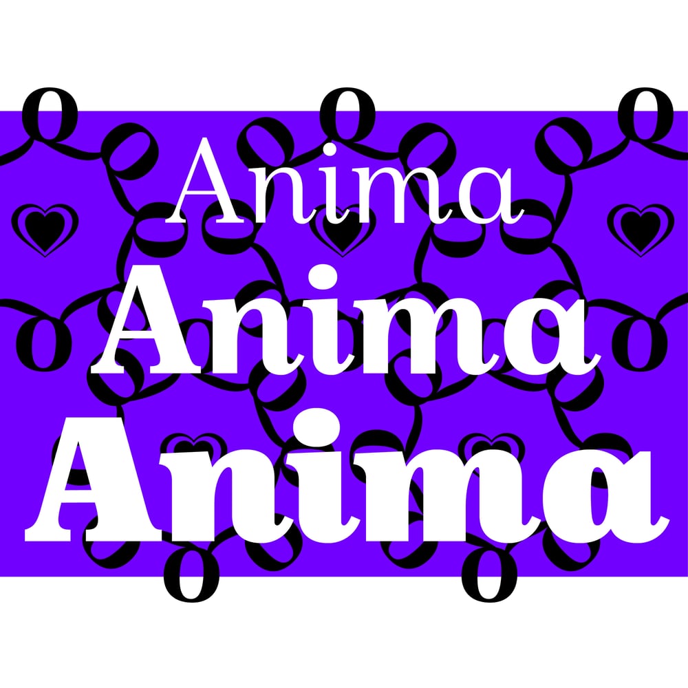
Die Schrift Anima ist über die Jahre gewachsen. Bisher hat sie drei Schriftschnitte.
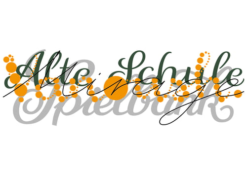
Es ist die Idee einer stehenden Kursiven, das heißt sie hat Merkmale von Italic wie gerundeten Endungen. Sie ist optimal geeignet für den Editorial-Bereich oder alles mit einem markanten, schönen Aussehen.
Feature • Font Anima
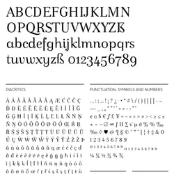
Font Anima Regular • Glyphs
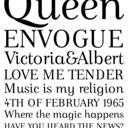
Font Anima Regular • Waterfall
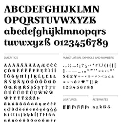
Font Anima Bold • Glyphs
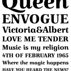
Font Anima Bold • Waterfall
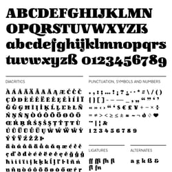
Font Anima Black • Glyphs
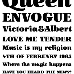
Font Anima Black • Waterfall